728x90
반응형
이번 포스팅은 Compose 스터디 중 어느 스터디원 중 한 분이 말씀하신 부분을 궁금해서 찾아본 결과를 포스팅하겠다.
# 구현 상황
@Preview
@Composable
fun AddMemo() {
    val inputValue = remember { mutableStateOf("") }

    Row(
        modifier = Modifier
            .padding(all = 16.dp)
            .height(100.dp),
        horizontalArrangement = Arrangement.End
    ) {
    	// 임시 TextField
        TextField(
            modifier = Modifier
                .fillMaxHeight()
                .weight(1f),
            value = inputValue.value,
            onValueChange = { textFieldValue -> inputValue.value = textFieldValue }
        )

        Button(
            modifier = Modifier.fillMaxWidth(),
            onClick = {
               // 아무 작업도 하지 않음
            },
        ) {
            Text("ADD")
        }
    }
}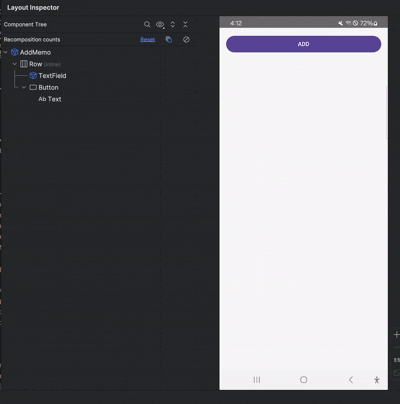
위 코드를 Layout Inspector를 통해 리컴포지션 횟수 분석 시 클릭 한 번으로 Count가 2번씩 올라가는 것을 볼 수 있다.
분명 코드에서 onClick 시 아무런 작업도 하지 않았는데 말이다..

# 원인
결론부터 말하자면 Button 컴포저블의 파라미터인 interactionSource 때문에 일어나는 것!
나는 이런 저런 검색을 해봤지만 정확히 나오지 않았다.
그러다 컴포저블 함수인 Button의 내부를 살펴보았다.
@Composable
fun Button(
    onClick: () -> Unit,
    modifier: Modifier = Modifier,
    enabled: Boolean = true,
    shape: Shape = ButtonDefaults.shape,
    colors: ButtonColors = ButtonDefaults.buttonColors(),
    elevation: ButtonElevation? = ButtonDefaults.buttonElevation(),
    border: BorderStroke? = null,
    contentPadding: PaddingValues = ButtonDefaults.ContentPadding,
    interactionSource: MutableInteractionSource = remember { MutableInteractionSource() },
    content: @Composable RowScope.() -> Unit
) {
    val containerColor = colors.containerColor(enabled)
    val contentColor = colors.contentColor(enabled)
    val shadowElevation = elevation?.shadowElevation(enabled, interactionSource)?.value ?: 0.dp
    val tonalElevation = elevation?.tonalElevation(enabled) ?: 0.dp
    Surface(
	    ...
	    ...
    )
  }
여기서 봐야 할 것은 파라미터에 있는 interactionSource다.
■ interactionSource란?
- 컴포넌트와 사용자의 상호작용을 추적하는 데 사용되는 도구
- 예를 들어 유저가 버튼 클릭, 터치할 때 발생하는 다양한 상호작용(press, drag 등)을 감지한다.
따라서 아래처럼 상태가 변경되어서 리컴포지션이 두 번 일어나게 되는 것이다.
- 클릭 시 pressed 상태로 변경 → 첫 번째 리컴포지션
- 클릭 해제 시 released 상태로 변경 → 두 번째 리컴포지션
# 해결 방법
성능에는 크게 영향을 미치지 않지만 리컴포지션을 일으키고 싶지 않다면 해결 방법도 있다.
방법은 커스텀 버튼을 제작하는 것!
<CustomButton>
// 커스텀 버튼 생성
@Composable
fun CustomButton(
    modifier: Modifier = Modifier,
    onClick: () -> Unit,
    enabled: Boolean = true,
    shape: Shape = ButtonDefaults.shape,
    colors: ButtonColors = ButtonDefaults.buttonColors(),
    border: BorderStroke? = null,
    contentPadding: PaddingValues = ButtonDefaults.ContentPadding,
    content: @Composable RowScope.() -> Unit
){


    Surface(
        onClick = onClick,
        modifier = modifier.semantics { role = Role.Button },
        enabled = enabled,
        shape = shape,
        color = colors.containerColor,
        contentColor = colors.contentColor,
        border = border,
    ) {
            Row(
                Modifier
                    .defaultMinSize(
                        minWidth = ButtonDefaults.MinWidth,
                        minHeight = ButtonDefaults.MinHeight
                    )
                    .padding(contentPadding),
                horizontalArrangement = Arrangement.Center,
                verticalAlignment = Alignment.CenterVertically,
                content = content
            )
    }
}
<AddMemo>
@Preview
@Composable
fun AddMemo() {
    val inputValue = remember { mutableStateOf("") }

    Row(
        modifier = Modifier
            .padding(all = 16.dp)
            .height(100.dp),
        horizontalArrangement = Arrangement.End
    ) {
        TextField(
            modifier = Modifier
                .fillMaxHeight()
                .weight(1f),
            value = inputValue.value,
            onValueChange = { textFieldValue -> inputValue.value = textFieldValue }
        )

				// 커스텀 버튼 활용
        CustomButton(
            modifier = Modifier.fillMaxWidth(),
            onClick = {
                // 아무 작업도 하지 않음
            },
            content = {
                Text("ADD")
            }
        )
    }
}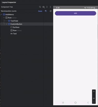
이 처럼 컴포저블 함수를 하나 만들어 활용하면 된다!
반응형
'소소한 개발 꿀팁' 카테고리의 다른 글
| [Git] .gitignore 파일이란? (1) | 2023.02.05 |
|---|---|
| 안드로이드 스튜디오 로그캣(Logcat) 이전 버전으로 돌아가기(돌핀 이전) (0) | 2022.11.27 |
| [Android] getAdapterPosition() Deprecated 해결 방법 (0) | 2022.08.20 |
| 프래그먼트 안에서 Activity,context 가져오기 (1) | 2022.03.30 |
| [Android]안드로이드 프래그먼트 종료(finish) 시키기 (0) | 2022.03.02 |


